Video Project
|
What is old, and what is new in any work of art?
Art Elements in art are the same, but the way that people interpret and use them are new. One person could see the element of Texture and use it in a crazy, totally “untraditional” NEW way. Just because someone knows how to use color or space does not mean that they must use it in a traditional way. When art is new and modern and different it can be scary because it’s different, but it’s also beautiful. Take Picasso for instance, his art was thought foolish and worthless, now a Picasso is the current most expensive painting, sold at an astounding 106.5 million dollars. The things that help create art (the elements and concepts) are old but the outlook and interpretation from the artist is new. How is art used in everyday life? Art is used in everyday life when you say something that makes people laugh, when you doodle all over your test, when you sing a random song about what you're doing, even the simple things are beautiful. Art is the hand of a baby when they grab your finger, art is the street sign on the corner, art is the outfit the stylish girl to your left is wearing. Art is whatever you interpret it to be. Even the hideous dorito statue by the DoubleTree is art to someone. Art is used in every way in everyday life. Graffiti, signs, people, music, laughter, doodles. Art is everywhere. How and why is art used as a vehicle for communication? Art is a certain kind of specialized communication. Communication is not necessarily art. Art does not equal communication, but all art is communication. It is communication for who ever made it. Art is self expression and expression is passionate individual communication. How does Material Culture influence artistic decisions? Material Culture influences artistic decisions by influencing what artists see around them. Since art is used as a vehicle for communication and self expression, what’s going on around artists can create passion or a need for them to express themselves. What problem-solving skills are employed in making works of art? Adaptability is super important when making art because problems are going to arise, it’s inevitable, but the way that you handle those things is vital. You can’t erase sharpie, but you can draw over it and create something even more beautiful than you were going to in the beginning. Problem solving is like that, learning from the mistakes and moving on or knowing when you need to start over or just color over the mistakes. |
For this project I knew exactly what I wanted to create. I knew that I wanted it to be about preventing teen suicide and I knew almost how I wanted to do it, the idea was pretty easy for me to come up with but putting it together was more of a struggle. Finding people who had time outside school and that could work well with us was hard. Im the beginning we found people and we had 90% of the movie made and then one of our main characters couldn’t finish it by the due date so we had to get a whole new cast. That delayed the whole process and made our video late. All of the tutorials and mini projects were super helpful.
|
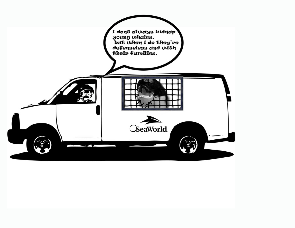
Political Cartoon Project
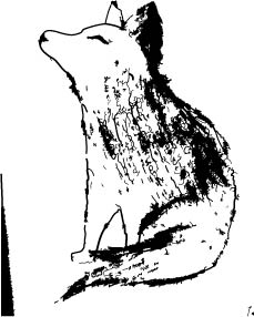
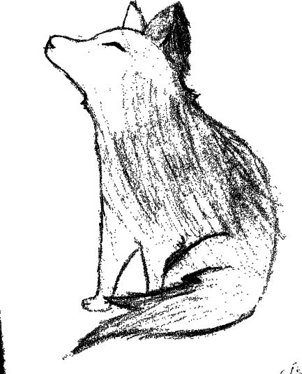
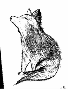
Prehistoric Art History Drawings
Comic Art
Black and White Logo
|
Inked Drawing
Lettering
|
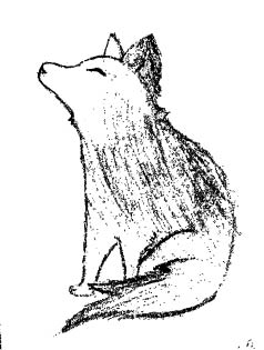
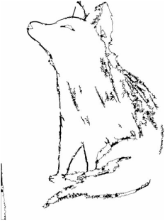
Hand drawn sketch
|
I started this project by looking at the picture of the example wolfe and deciding how I was going to do it, like if I was going to make it bigger or smaller and I decided to keep it about the same size so I could get all the proportions correct. The context of the project was learning about the Pre historic art and, specifically for the drawing, the domestication of the dog and how that affected human life. The resources I used to improve my drawing skills were the different shades of pencils and how they can make something appear more realistic and also how it’s easier than making sure all your strokes are the same throughout your drawing if you’re just using one pencil. Using the image trace technique impacted my drawing by adding different textures and shades. I think that specifically for the drawing it added a little bit, however I think that overall just using it was more important and impactful. I can see myself using this technique in future art projects. To make them better, to create more detail, add lines, move lines, and just editing the overall appearance and make it look more refined. I think that this project was really interesting, however I think that we should have just learned it through the picture, not the worksheet.
Self Portrait
Teacher Creature! |
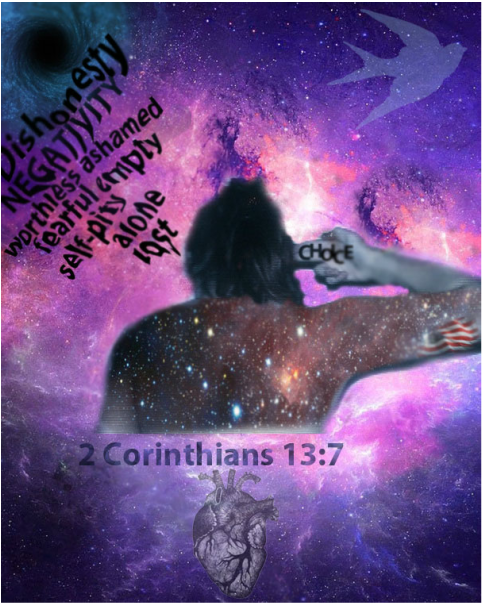
Artist Statement This is a self portrait, but it's more than that. Its a self reflection. A deep look into how I see myself, how I respond to myself, and How I identify with the world as an individual. I chose to put myself in a Galaxy background for a couple reasons, one because I have a deep fascination with the stars, and as you can tell in my body I have another galaxy. Because that's what I am. I am a galaxy inside of a galaxy. I am so small, yet so filled with uniqueness and my own light. The gun to my head, as you can see, is my representation of my choice to rid myself of all the things I don't want to be. The things I want to get rid of. I put the american flag in my arm because above all i am so deeply ingrained with the freedom and choice of this country, I hope to become a marine. The heart and the sparrow are a deep connection of how I long for my individual freedom to fly away from standards, to be completely free of any restraints. The heart represents the way I want to love others. The way I want to use my heart and touch another galaxy.
|
|
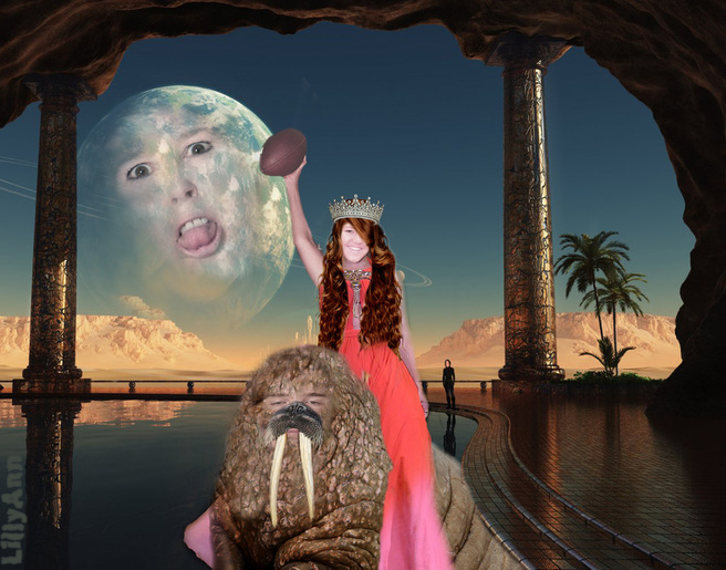
Project Reflection!In my project I used Laurel Rodd, Hannah Starbuck, Joshua Jacques, and Lacey Anderson. I used Laurel as the moon in my background, Hannah as a the silhouette's face in the background, Josh as the walrus, and Lacey as Beyonce riding the walrus. The first step I took was to put the walrus in my sci-fi background and then pasted Josh’s school photo on the face of the walrus. I then used the color balance and saturation to get Josh’s face color closer to the color of the walrus. I then used the clone patch tool to get the texture of the walrus onto Josh’s face. I then got the picture of Beyonce and put her on my background and pasted Lacey’s school picture on Beyonce’s face. I then used hue and saturation to get Lacey’s face the right color. Then I put an arm holding a football on the body using paste and copy. Then I put hair on Lacey’s head and a crown on top. After I was done with Lacey I started with Laurel. I copy and pasted her face (after I had used the quick selection tool and refined the edge, as I did with all faces and other accessories) onto the moon in my background. I sphererized her face and clone patched the texture of the moon onto her face.
The hardest part of this project was when I was first trying to make Josh’s face into a walrus face. I wasn’t sure how to get the same texture from the walrus onto his face. I asked Sienna how to and she reminded me how to use the clone patch tool and that made everything easier. I used it on Laurel’s face as well. My favorite part of this project was making my signature. It was my favorite because it was simple and fun to warp it and make it fit well in my project. What I learned about myself as a digital artist was that sometimes I need to think out of the box and listen to my peer’s critique more often; to have an open mind. However, I’m good at persevering and I am a quick learner. |
Photoshop Tutorials!
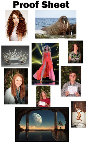
Original Picture
|
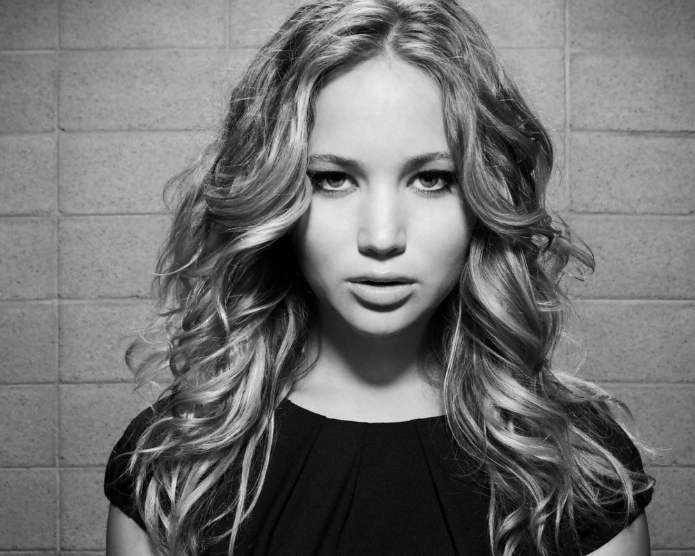
In this Picture I changed her hair color with a soft brush, masked her face with cracks, and changed her eye and lip color with the pen tool.
|
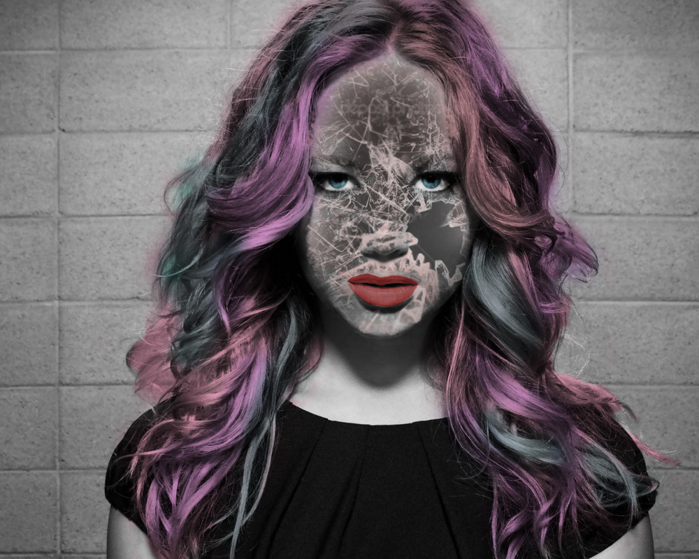
Original Picture
|
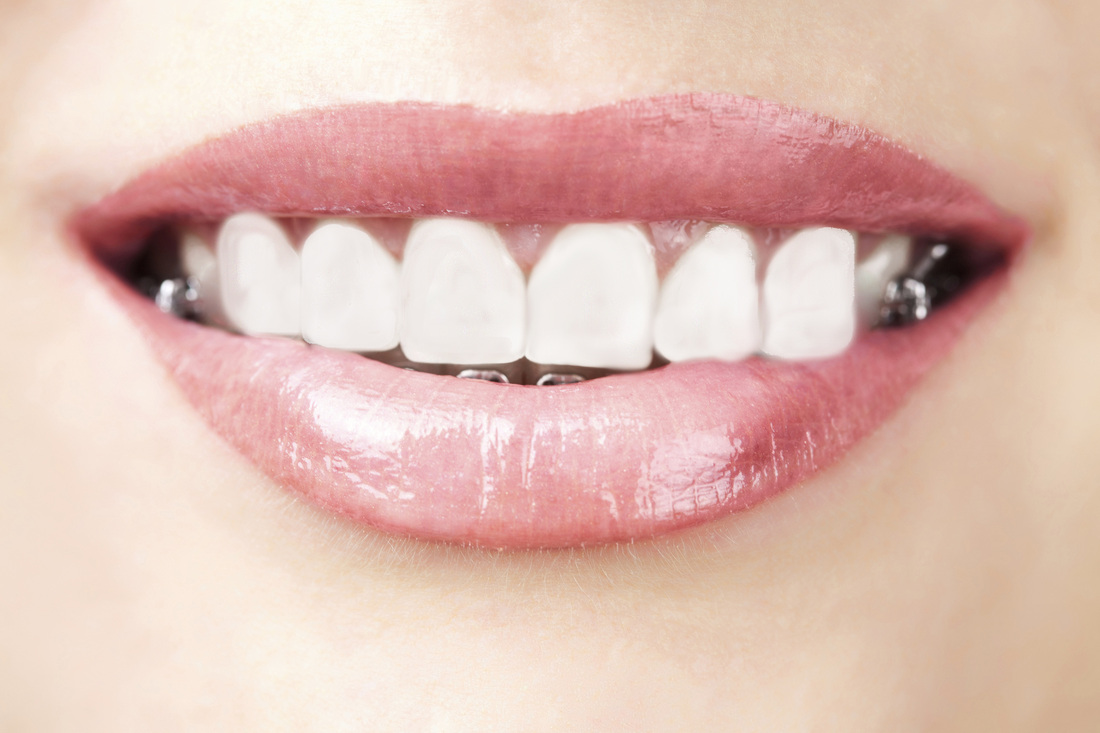
In this picture I used the Patch, clone, and blur tool to remove the braces
|
LandScape Project!
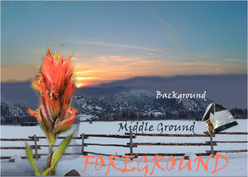
In this photoshop project we learned about Foreground, Middle ground, and Background and the properties that should be included in each one.
Foreground should be:
~ In focus
~detailed
~Textured
~Vibrant
~Contrasting
~ Include large object
Middle Ground:
~Color is less vibrant
~Texture details are blurred
~large objects actually appear mid size but you can still see them as individuals
Background:
~All objects blur together
~Very little to no contrast
~Color is almost absent
Name Project!
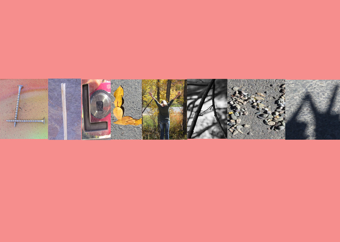
This was my first freshman photoshop project. We were told to go outside and find (or make) natural letters that would eventually be compiled into my name and take pictures of them. We then used photoshop to organize the pictures into our name and use the paint (or gradient) tool to make our background.
HELPFUL RESOURCES:
Free Photoshop Brushes (brusheezy.com)
Free Fonts (dafont.com)
55 Ways to Use Text
100 Ways to Use Text
Youtube Tutorials
Digital Art Online
Photoshop CC Basics: http://jetsetcom.net/useful-resources/photoshop-cc-resources.html
SHOW and TELL Photoshop Basics: http://simplephotoshop.com/photoshop_tools/index.htm
